
Album Artwork , Various Artists
Art Direction · Identity · Illustration · Music · Print · Typography
There’s nothing we find more satisfying than creating album artwork that helps transport music we love to the ears of those that are listening for it. Below are a few of our recent projects…


Snapped Ankles – Stunning Luxury
Album artwork for our favourite forest folk, Snapped Ankles, with fluorescent pink cover, and featuring wet plate collodion photography by Kasia Wozniak.
For their latest release, they ventured into the big city, looking to sell their Stunning Luxury to the highest bidders. They teamed up with independent record store collective Dinked Editions, to create a limited edition gold release with gold vinyl and gold printed and foiled cover.

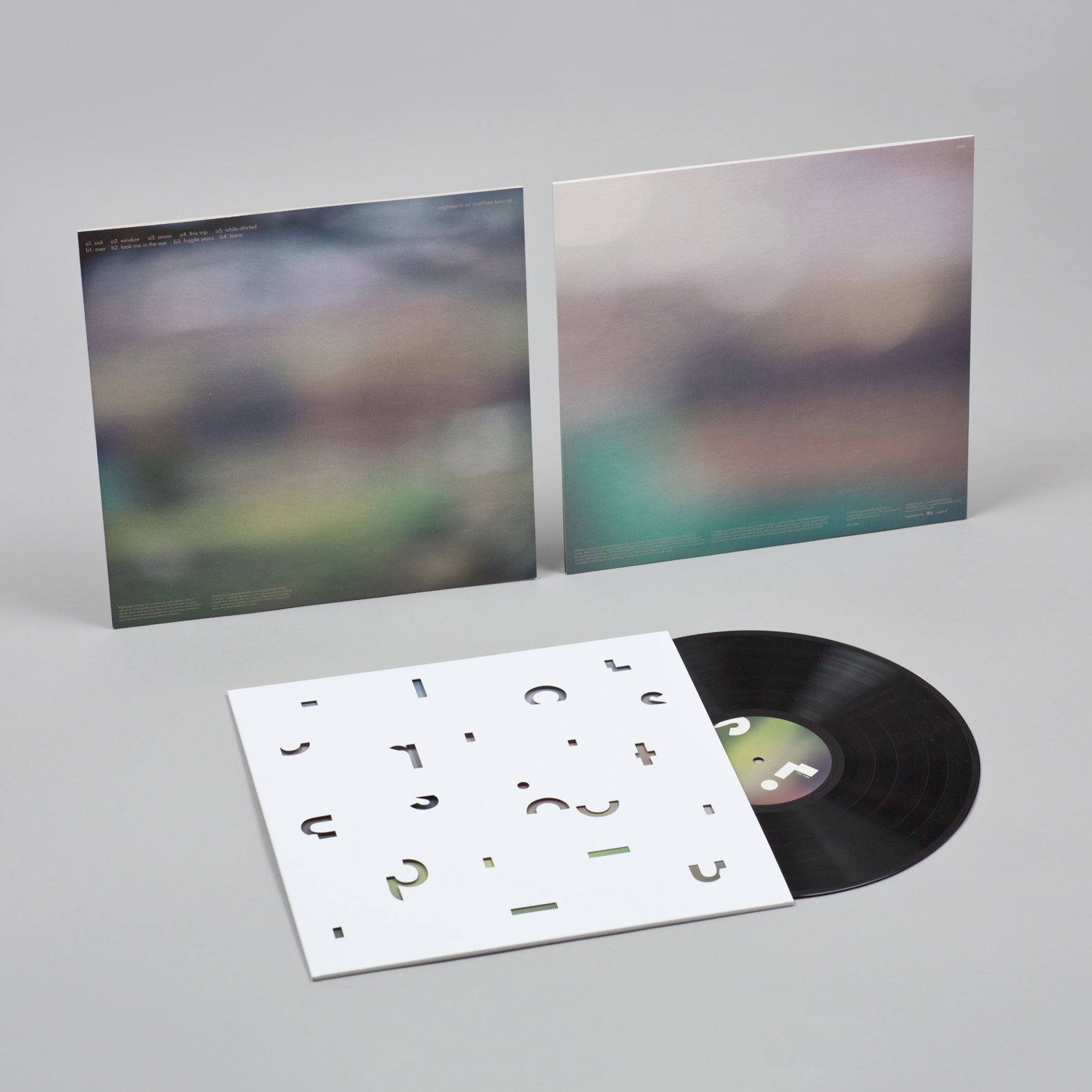

Nightports W/ Matthew Bourne
“Nightports is based on a simple but unbreakable rule of restriction: only sounds produced by the featured musician can be used. Nothing else. But these sounds can be transformed, distorted, translated, reworked, processed and reprocessed, stretched, cut, ordered and reordered. This forces us to explore those sounds thoroughly and inventively. And it maintains our focus on celebrating what’s particular about that musician and the sound they make.” – from Nightports’ manifesto
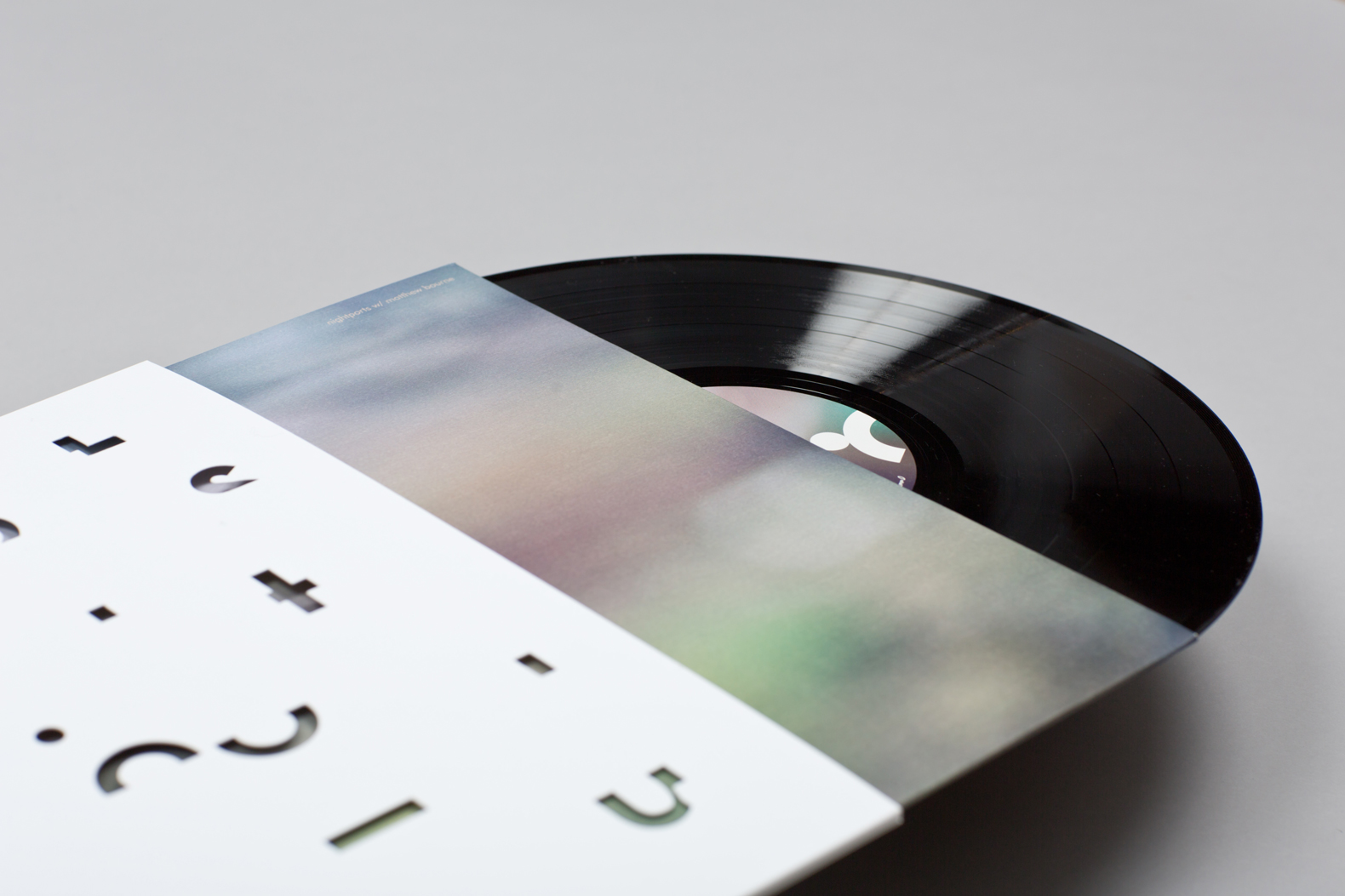

Nightports’ identity and subsequent album artwork is created to reflect their unique process – their identity is created only from the original letters of their name, cut up and remade into a new and more abstracted form. Through the textured, die cut sleeve can be seen the photography of regular collaborator Sara Teresa, her subtle, shallow field images taken in the hills around Matt’s home.
You can hear Nightports’ incredible release W/ Matthew Bourne – the first in a series of collaborative records for the The Leaf Label – in all the usual places here.

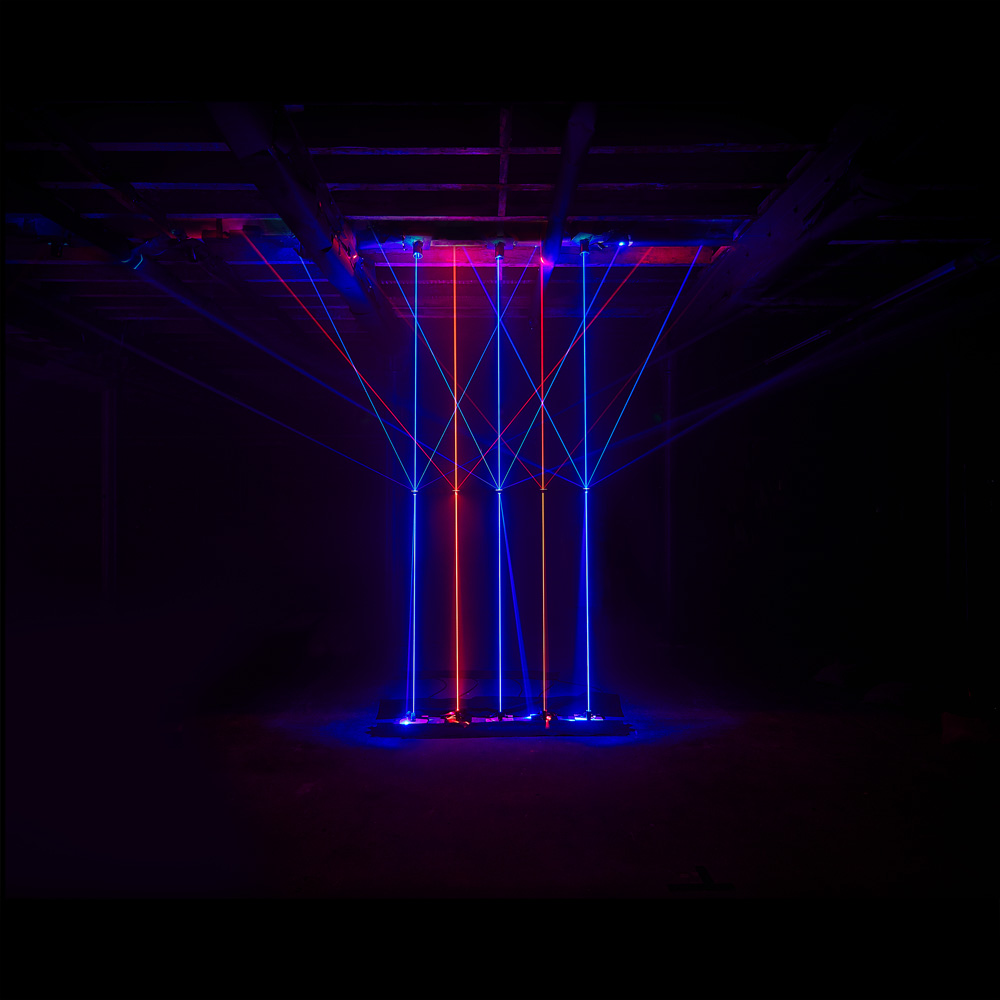


Vessels – The Great Distraction
Created from 25 high-powered lasers and voted as one of the best 3 pieces of international vinyl artwork at The Art Vinyl Awards 2017
We were asked by Vessels to create the album artwork for their new album The Great Distraction, featuring The Flaming Lip’s Wayne Coyne, John Grant, Vincent Neff of Django Django fame; and Katie Harkin.
See the full case study in our portfolio over here.


Comet is Coming
Identity and cover design for the Comet is Coming’s Mercury-nominated debut album, Channel the Spirits, featuring the stunning photography of Fabrice Bourgelle.


Julia Kent – Temporal
Canadian cellist and composer Julia Kent’s Temporal is a meditation on the transitory and fragile nature of existence. To complement the beautiful photography of Tan Ngiap Heng, we looked to create a typographic concept that reflected the “plaintive cello lines floating over metronomic rhythms [that] echo the passage of time, and the emotions that can evoke.” – The Lead Label


Chris Potter – Circuits
Album artwork for New York based saxophonist Chris Potter, for his latest release Circuits. One of the leading musician’s of his generation, Potter teamed up with James Francies on keys, Eric Harland on drums and Linley Marthe on bass for this return to an electric sound.
Released on UK label Edition Records. For more details of all our work with Edition Records, see the separate case study here.


Snapped Ankles – Violations
Typographic artwork for the Violations EP by Snapped Ankles, pressed to white vinyl.

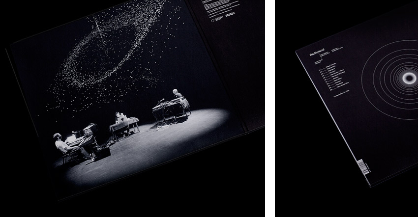


Radioland
The Leaf Label asked us to create the packaging for Radioland, a re-imagination of Kraftwerk’s Radioactivity by pianist/composer Matthew Bourne, sound artist/composer Franck Vigroux and visual installation artist Antoine Schmitt.
Using Schmitt’s stunning live visuals, we created the limited edition gatefold vinyl packaging and hard-backed book & CD. Available here.


Matthew Bourne – Isotach
Album artwork for long-term collaborator Matthew Bourne.
The recordings took place during what Bourne describes as “extreme weather” from his home, located high up on the side of hill in West Yorkshire. The artwork was inspired by a visit to Matt’s home during a storm, standing by his piano and the large windows overlooking the valley and feeling completely surrounded by weather. Indeed, if you listen carefully to the album you can hear the wind and rain picked up on the microphones.
Each track was assigned a weather symbol, relating to the weather on the day and time of recording, brought together to create the minimal cover reflecting the sparse instrumentation – the calm in the eye of the storm.
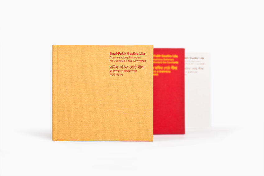
SGB Recordings
A set of albums released by Sadhu Guru Boishnob Recordings – a label dedicated to producing high quality field recordings to preserve and continue the traditional Baul-Fakir songs and music from Bengal.
The packaging design was inspired by a traditional Bengali rug, which was created for the project to be recorded on. The rug is made of four coloured cloth squares in yellow, red, white and brown, representing four key natural elements in local folklore. The recordings were conducted in a specially constructed mud hut, by some of the most knowledgeable musicians of the region and with instruments hand-made specifically for the project. Reflecting such a high dedication to detail in the recording and making of the albums, the packaging features Japanese-bound booklets set onto cloth-covered board & embossed with both English and Bengal script throughout.